Eye tracking? Heard of that? Know how it affects you and your store’s sales?

Eye tracking is defined as research to track where a user’s eyes look while reading, then analyze the data to reveal behavioral patterns. In essence eye tracking is a core part of usability & accessibility.
So we know that you can drive thousands of visitors to your website a day and not make a dime…. These issues related to the usability of your store are the most common reasons for poor conversions and sales.
We are going to specifically go over some big issues for shop owners in the realm of eye tracking today. I promise to revisit the full usability side when I finish Steve Krug’s, “Don’t Make Me Think” 2cnd Edition.
Recent behavioral eye tracking studies have identified some very useful metrics regarding eye tracking and how user’s navigate your online store. We learn more and more everyday about the user interaction and emotional responses to our content and pages. What I’m covering here are just some basic, fairly unconsidered facts, to help you gain some insight in to your shoppers habits and needs.
Eye Tracking Tips for Ecommerce
- Heading Tags – I have said this before and I’ll say it again… Visitors read text first upon hitting your page about 1 second is spent scanning for text to identify the page as relevant or irrelevant to the visitor’s query or need. Yes, that’s right you have about 1 second to get them interested! Heading tags are a perfect way to grab the attention of these text scanning machines we call visitors. Keep your heading tags, short, logical and highly relevant to engage shoppers more quickly.
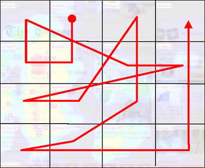
- Eye Movement Patterns – Your visitors will averagely read/scan your pages in a particular order (shown below from Eyetrack III). Notice where the user starts his quest to determine if your page is useful… Top Left. Ask any search marketing professional and they will tell you this is one of the most highly effective advertisement areas of a page. While I certainly don’t want to see you with PPC ads in your store, utilizing this space properly is key to visitor engagement.

- People scan the first few words of a paragraph and then quickly make a decision to read it or move one. Back to high school with this one. Remember that English teacher teaching you to use a power sentence to start your paragraphs. Creative and visual writing skills have never been more important…. The first sentence is the hook.
- Keep it short! We know from that same high school English teacher that a paragraph is a container for a single thought. In keeping with that shorter paragraphs actually are less daunting and encourage better reading.
- People naturally seem to migrate top and left when seeking navigation. Right hand navigation has its place indeed, many blog surfers have come to expect right hand navigation from the reading they do… This has not yet, however, transferred in to the general reading and shopping ranks. Topside navigation while interestingly more effective according to the study can be a real nightmare for shoppers to navigate in ecommerce applications. In essence the top navigation is only going to work for your simpler menu options… Not 50 categories and children fly outs. So, standard left hand navigation is still going to be more effective and engaging in your online store.
- Categories are the key to every store’s navigation, but also the biggest area of confusion and bottlenecks for shoppers as well. On one hand we know that the fewest number of clicks to get to paying you is most effective, we also know that logical and clearly categorized navigation will yield a better average order value. The biggest issue is when a shopper is forced to browse through page after page of product index. Most times these products, say numbering 80 can be just 4 pages. However, we also know that the click through drops about 50% from page 1 to page 2 and by the time we get to page 4 only about 3% of the shoppers remain… The rest bailed. So shorter product indexes, ideally one page with your most popular products first will keep the shopper more engaged and on track.
- This I found most interesting, smaller fonts seem to engage readers. So those of you running those 14px fonts are actually encouraging scanning as opposed to reading! The standard is a 10px font, and I would recommend never larger than a 12px. If your visitor profile demands it, then get a text sizer tool for your pages.
- Textual ads within your store will be far more effective than graphics. Aside from the entire banner blindness issue, people are just more willing to click text ads. So just having a neat and crisp “Free Shipping” heading tag will do the trick nicely.
- I have been telling shop owners about the power of color psychology for a while now….. But here you go. In this study a HUGE contrasting red font containing information was completely missed 86% of the users tracked! BAM@!
- How about product pricing? This can really be a heated topic…. But here we see the nuts and bolts of how those numbers came to be .99 and what they should more effectively be .47 or .49 to catch price scanning eyes.
The basic point of this is to establish one thing in your mind… You have no idea what your shoppers need until you ask them. Doing a simple usability study with friends will reveal problems you would have easily missed.
Never stop improving your store, solicit the feedback of your shoppers. Most importantly whether you pay for a usability study, conduct a small usability study on your own or ask for feedback… YOU MUST LISTEN!
Remember, it’s not about what you think… It’s about making a living.
