
-
Credit Card Testing
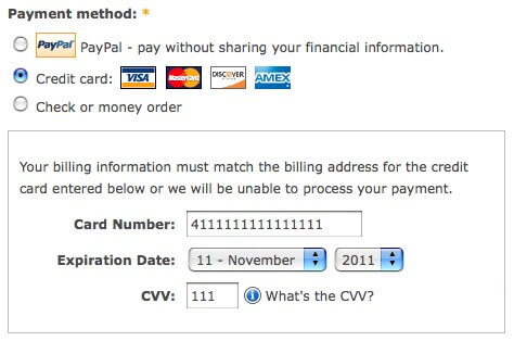
It’s scary out there and I know we can’t catch them all…. But let’s be a pain in the hacker’s a$$ this holiday season!
-
Google Will WARN Searchers About Sites Without SSL
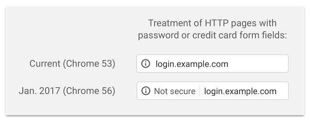
Firstly, Zen Cart users ….. GET AN SSL and stop being a contributing factor to insecurity, low buyer trust and general ignorance. In a nutshell Google is going to ding you ALL with a warning, even those who only accept PayPal. Rightfully so, while you’ve never been required, you should have been supporting buyer trust…
-
PCI DSS 3.2
Here we go again…. I am writing this to, hopefully bring you the best and simplest understanding of your roles, changes and responsibilities. In December 2015 the PCI/DSS council released a bulletin containing changes which are required to be implement by June 2016. So below, in addition to all the PCI/DSS items you are currently doing,…
-
Checkout Reloaded Demo for Zen Cart 1.5.4

We are so very excited to talk about Checkout Reloaded. Ironically, the checkout modules does anything but reload =) UPDATE !!RELEASED!! GET IT HERE Checkout reloaded is a module we have been developing internally for a more pleasing and still secure checkout experience. While we haven’t released it yet, we wanted to give you all…
-
Get More Sales … Don’t Suck!
Ecommerce is a tough business. It moves fast, changes frequently and relies on outside factors, which are often beyond our control.